© 2026 Jiaqi Design. All Rights Reserved.
Shaping ideas into clear and memorable visual systems.
Branding, packaging
and digital touchpoints.
Jiaqi Li is a visual designer working across brand identity, packaging, and digital experience.
Her work is grounded in visual storytelling and system thinking, translating ideas into clear and distinctive design languages across identity, packaging, digital, campaigns, and illustration.
With a cross-disciplinary background in visual communication, she develops projects from concept to execution, creating thoughtful visual systems that shape both how a brand looks and how it is experienced.

Brand thinking.
Visual systems.
Packaging stories.
Digital clarity.
JIAQI LI.
(01)
Experience
(02)
Service
Visual Design.
Brand Identity.
Packaging.
Website & App.
Graphic Design.
Illustration.
(03)
Contact
© Jiaqi Design 2026
ÉLARA
泊光
INDUSTRY
Beauty & Skincare
SCOPE
Logo Design
Package Design
3D Visualisation
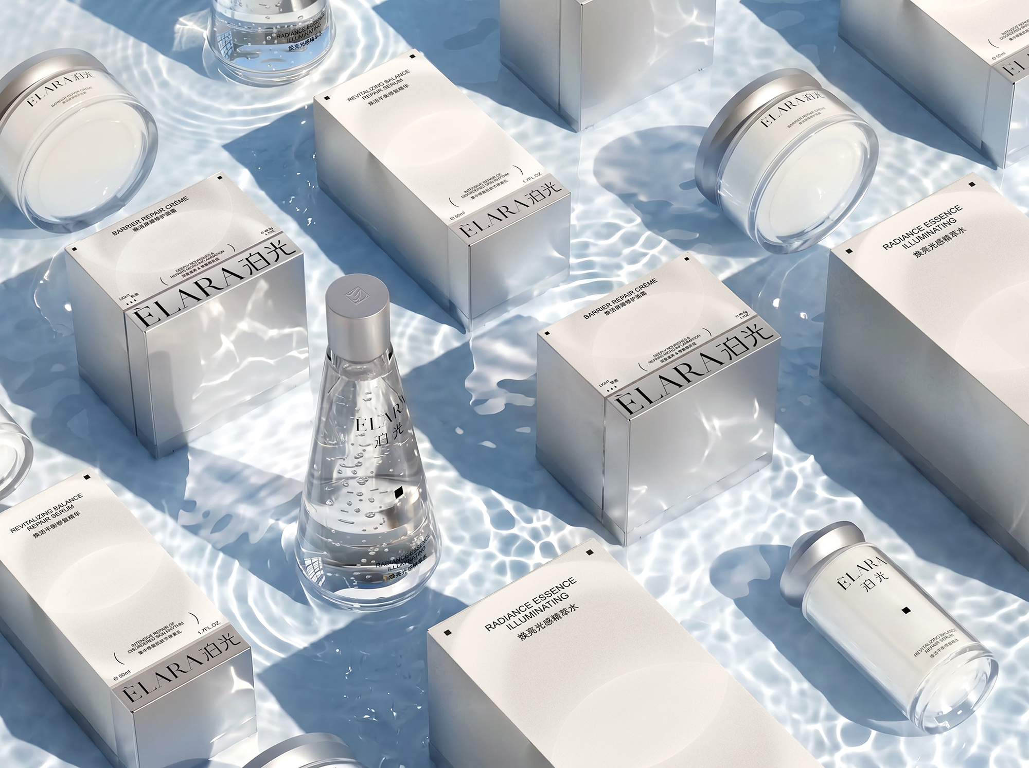
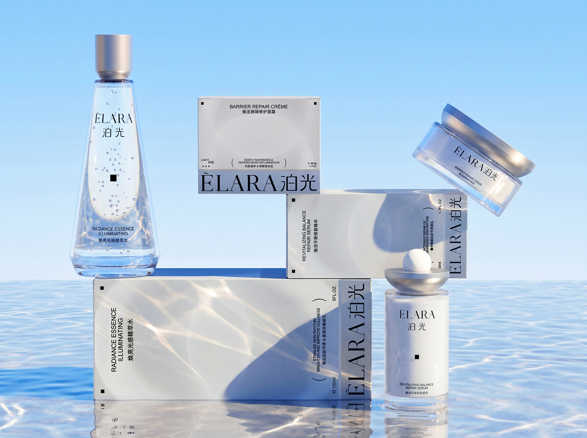
ÉLARA is a premium science-led skincare brand focused on supporting the skin’s natural rhythm. As consumers increasingly look beyond immediate results to consider ingredient credibility, gentleness and long-term skin health, the brand needed a visual system that could communicate both professional expertise and premium value, while moving away from the conventional aesthetics of clinical skincare. A unified product architecture, distinctive material contrasts and clear information hierarchy bring the three core products together as a coherent and recognisable range.
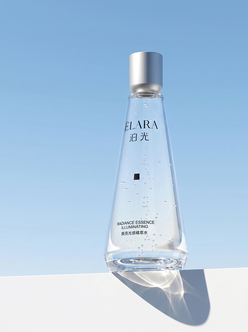
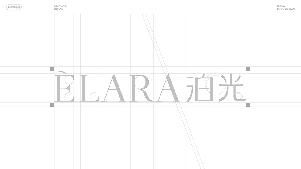
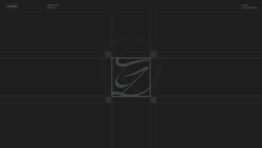
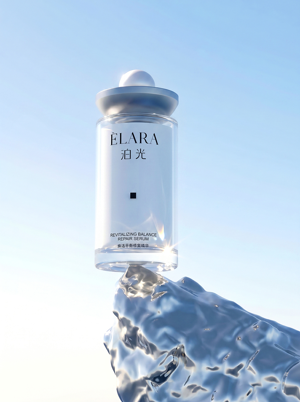
Built around the idea “Let Light Stay on Skin,” the identity moves away from the conventional promise of resisting age. Instead, it celebrates the natural radiance, clarity and vitality of skin at every stage of life, as though softly enveloped in light. The wordmark uses a contemporary serif typeface with a subtle humanist quality, giving the brand a refined yet approachable expression. The symbol combines the letters E and L into a continuous curve, creating a light, fluid form reminiscent of light in motion.
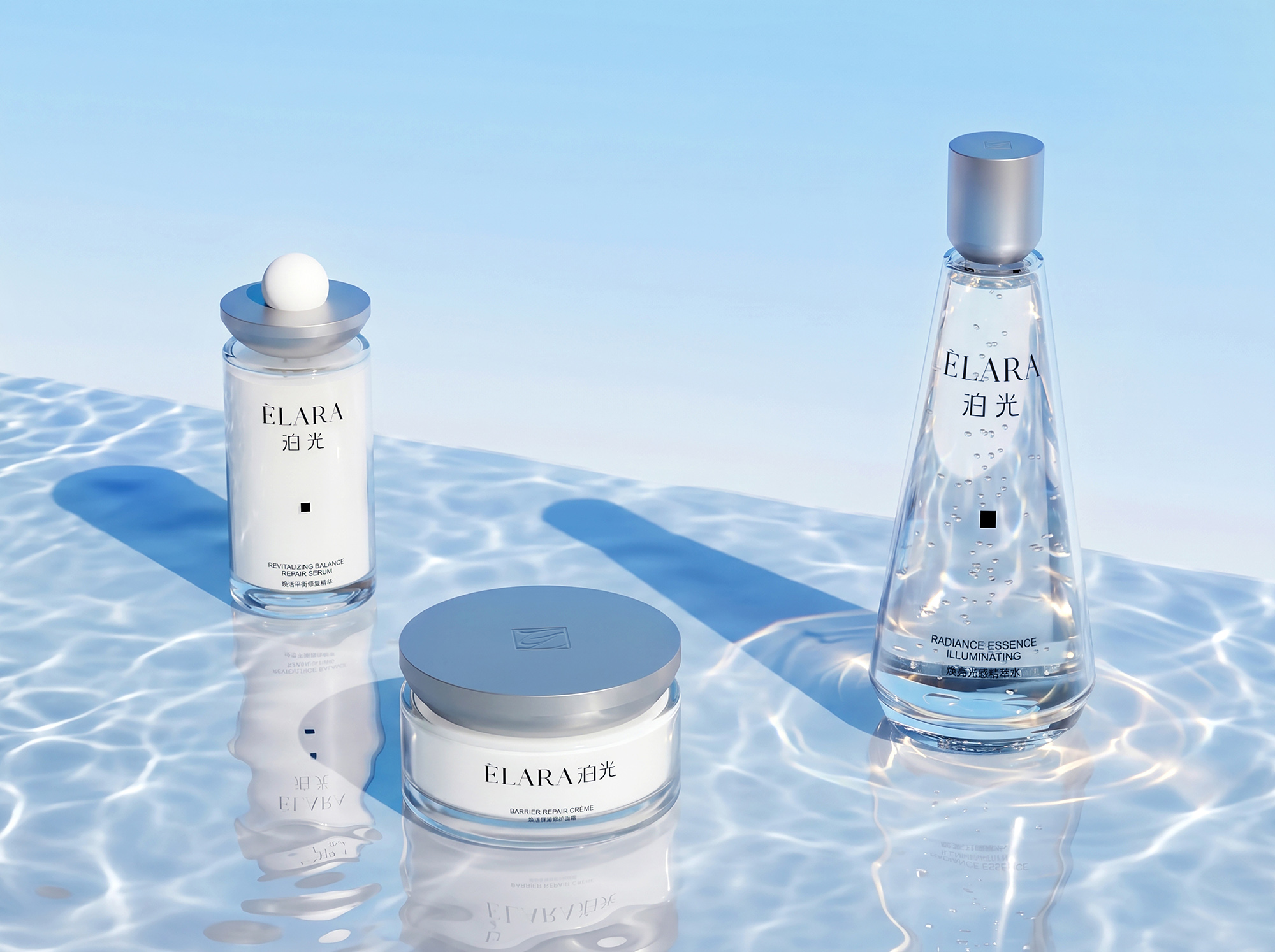
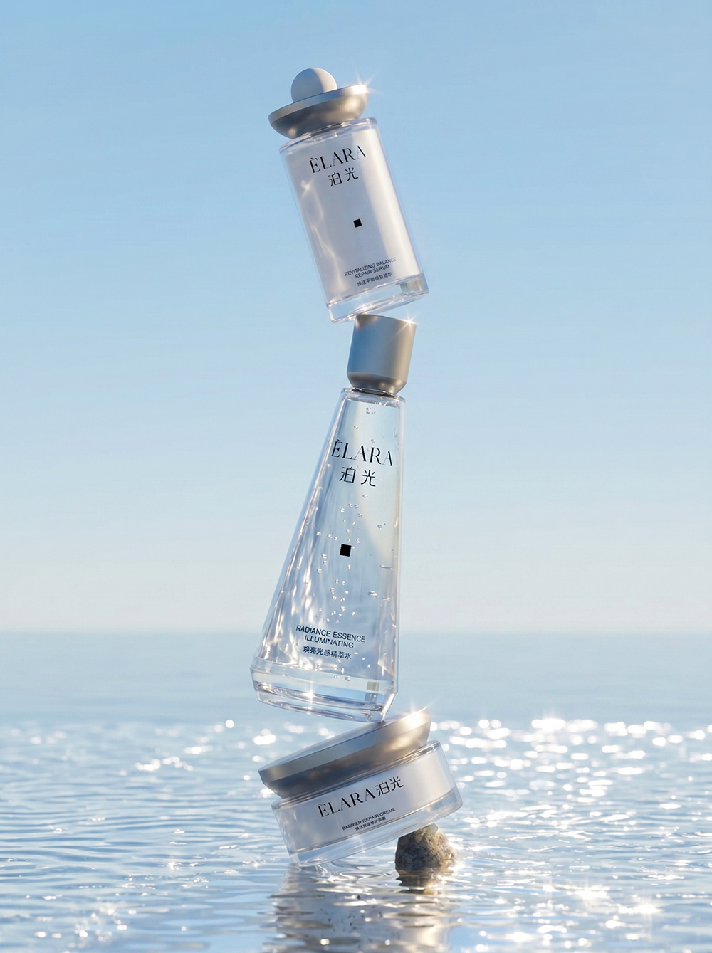
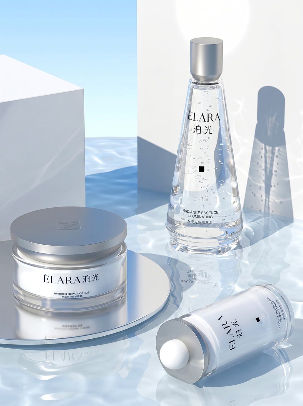
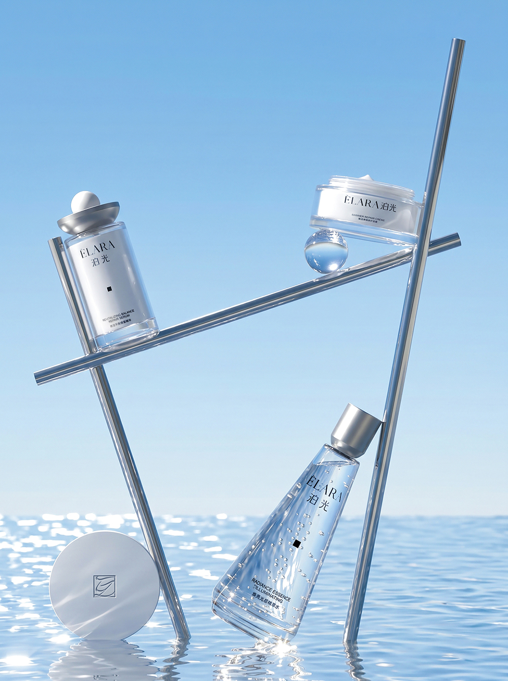
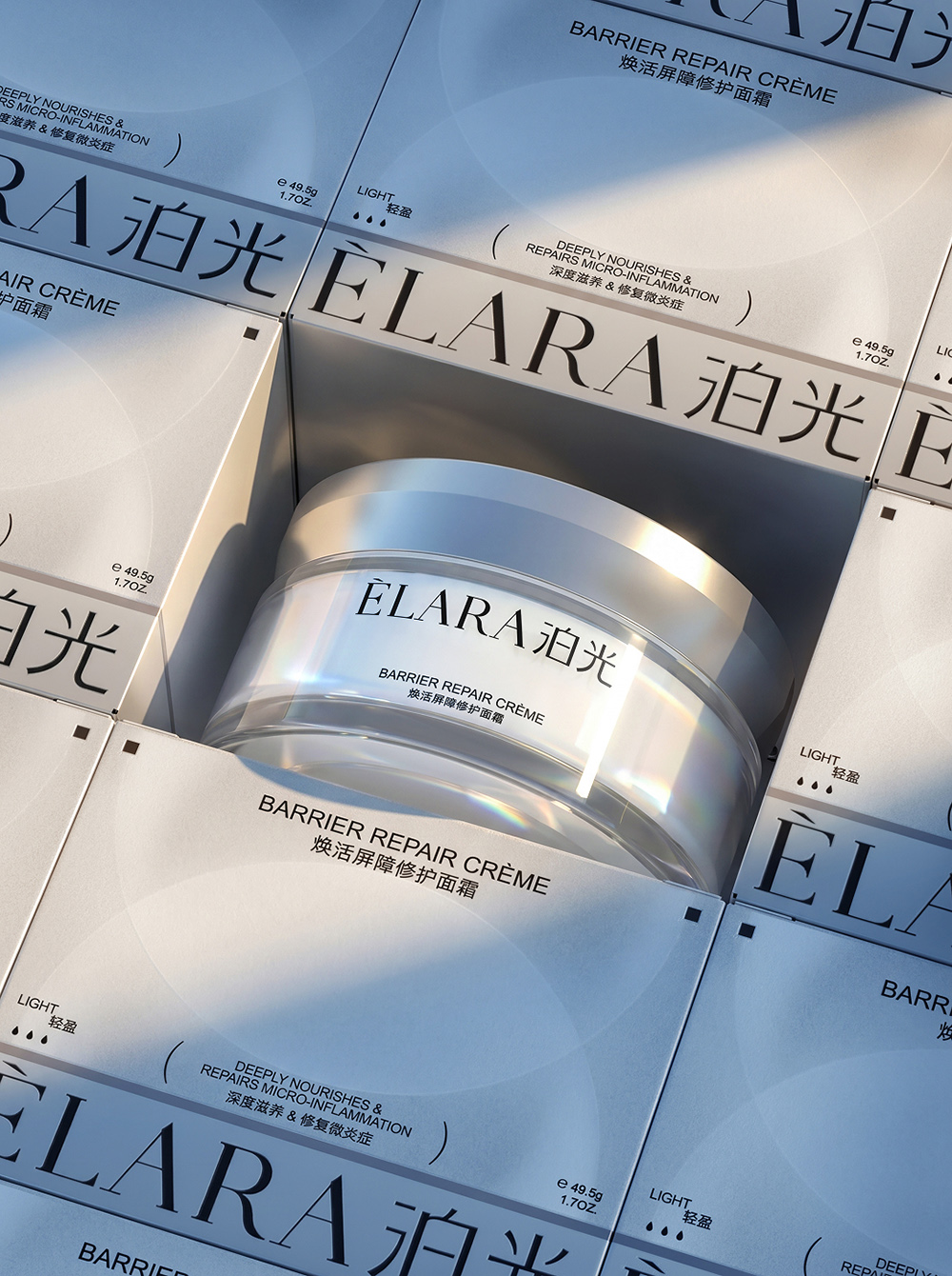
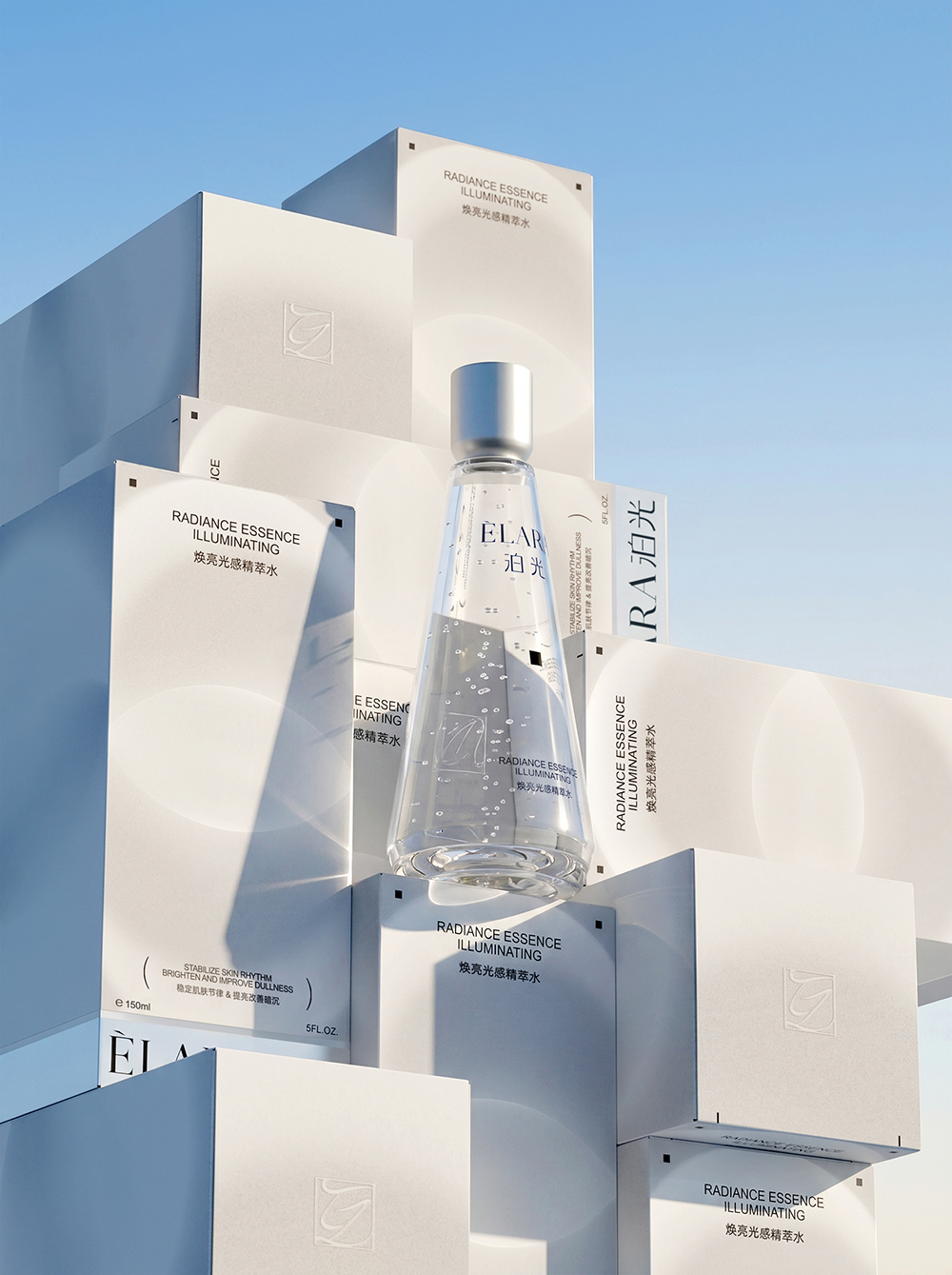
The packaging uses clean geometric silhouettes and a clear information layout to create a product presence that feels both scientific and premium. Transparent vessels communicate purity and clarity, while matte silver metal caps bring a refined, professional finish. Generous white space and softly diffused halo graphics extend the central idea of light across the outer cartons. Reflective silver card at the base shifts subtly with changes in light and viewing angle, allowing the concept to move beyond printed graphics and become part of the physical packaging experience.
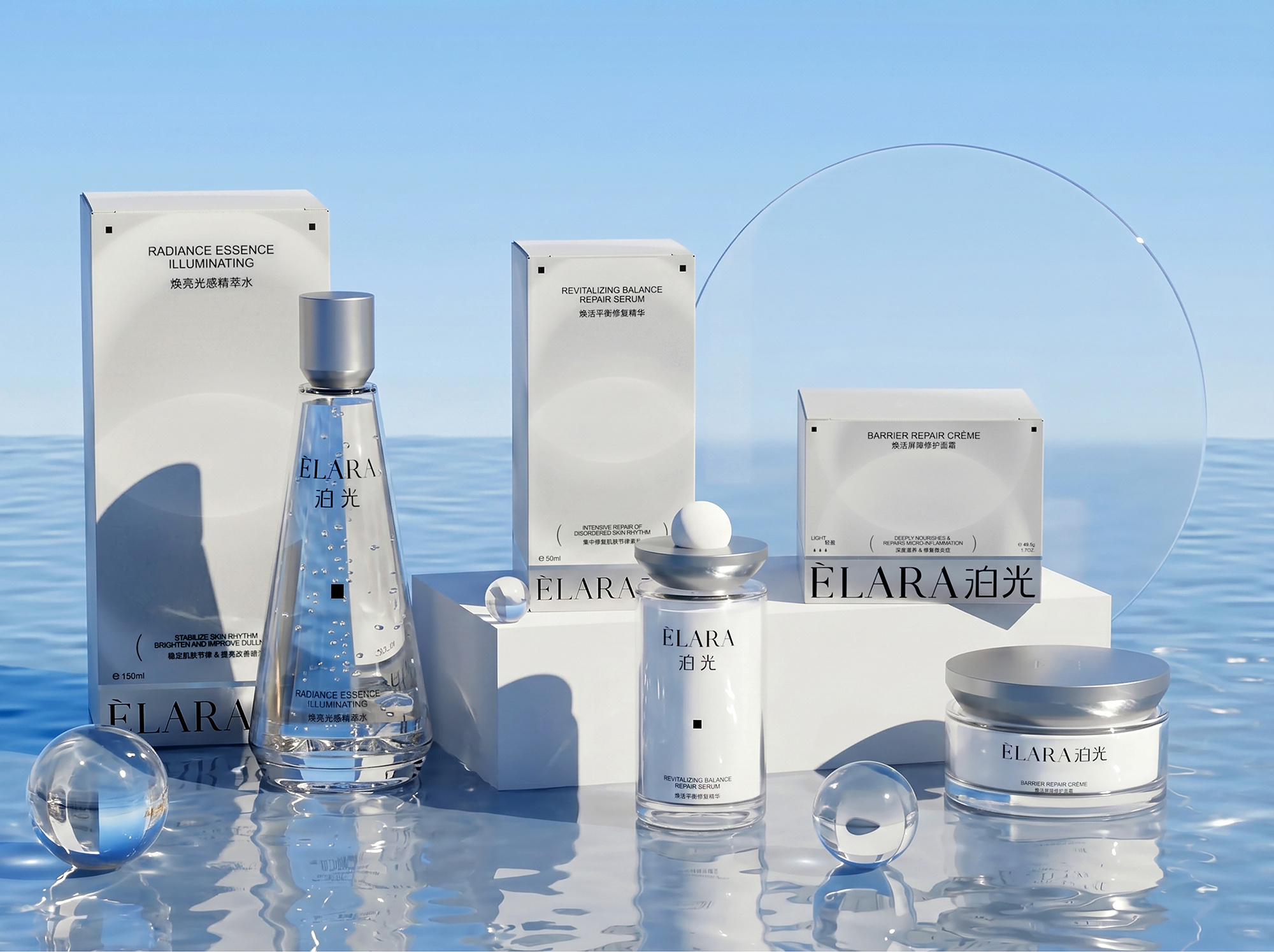
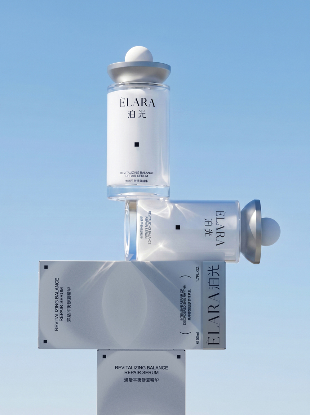
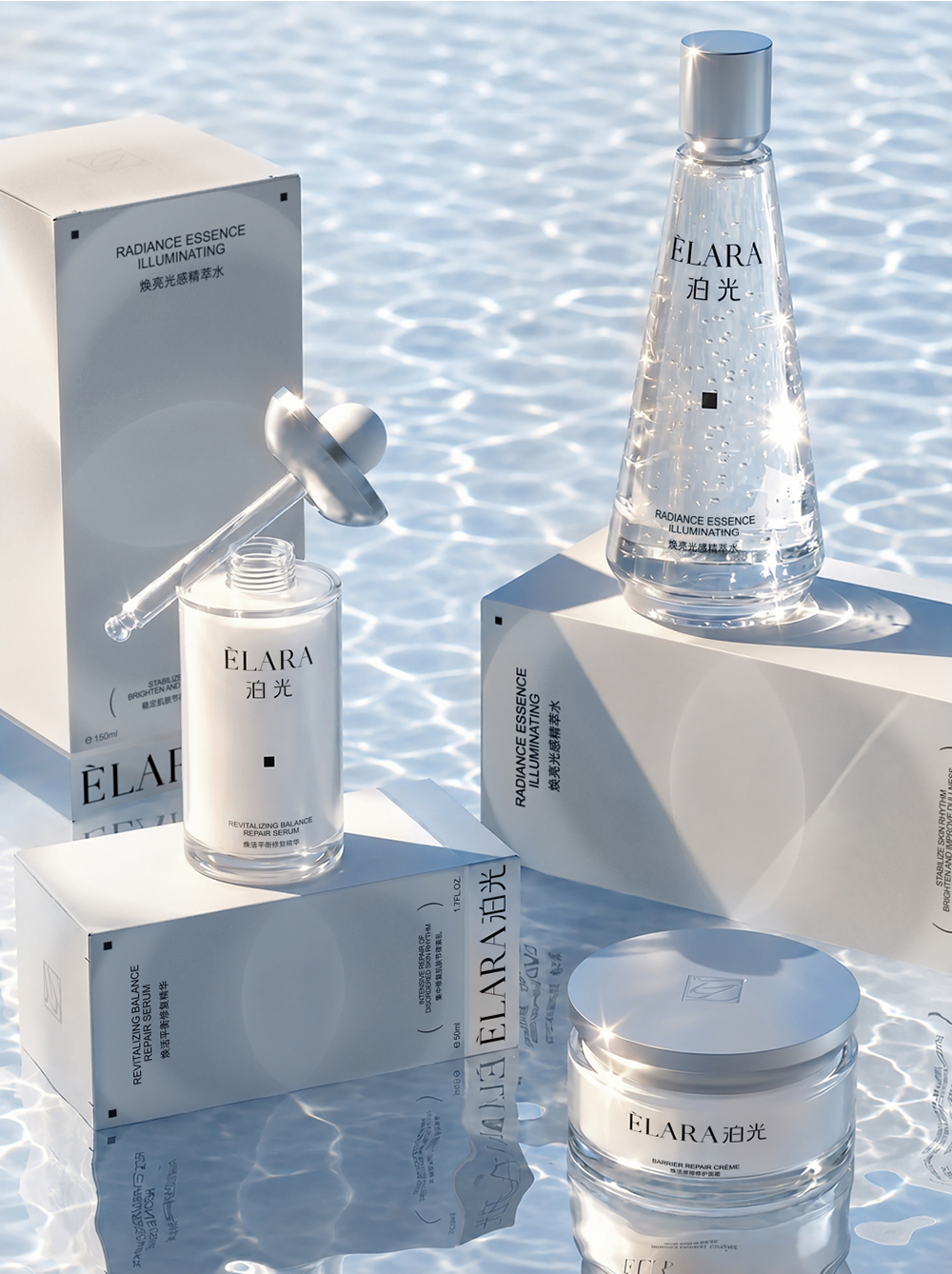
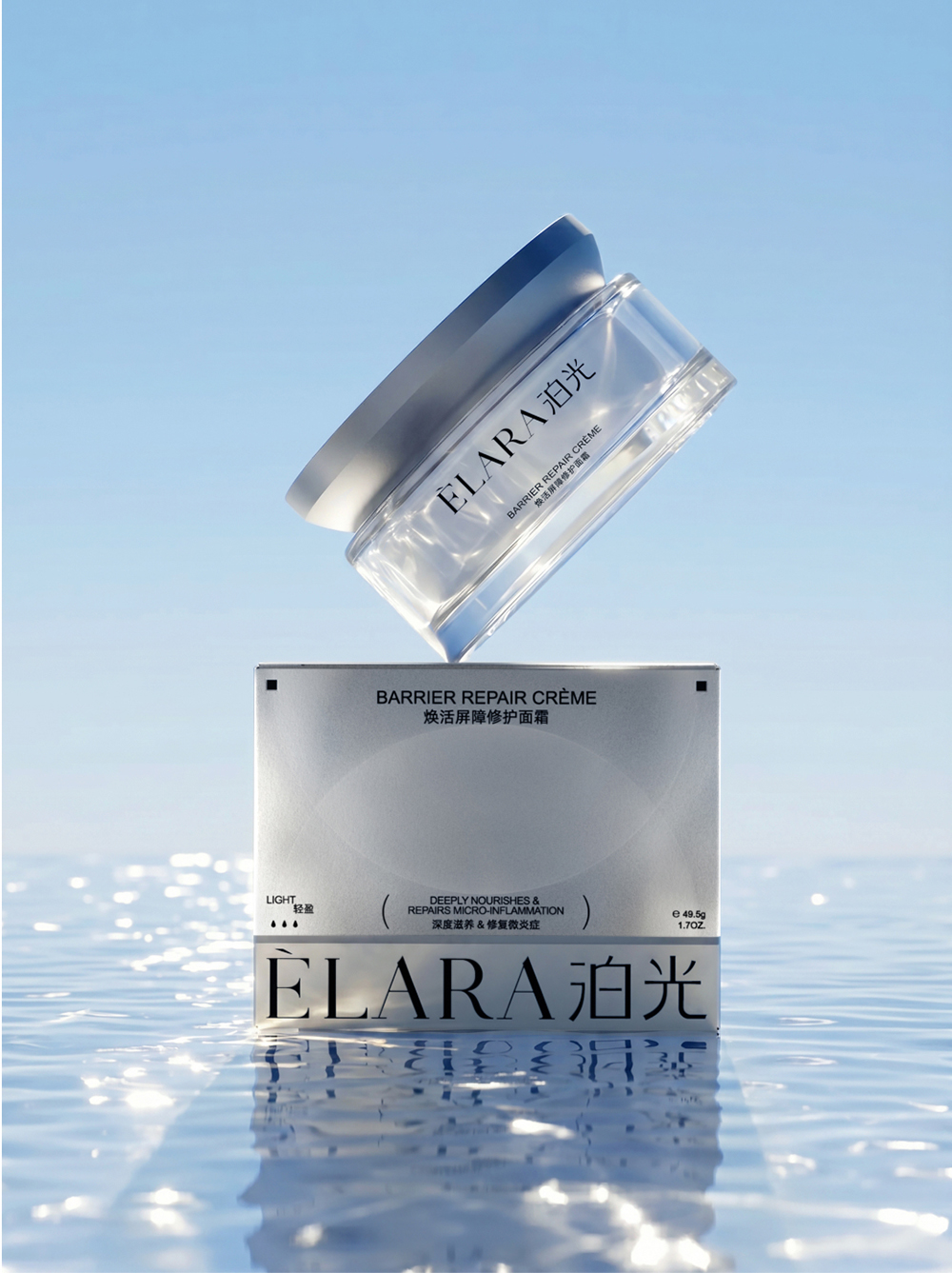
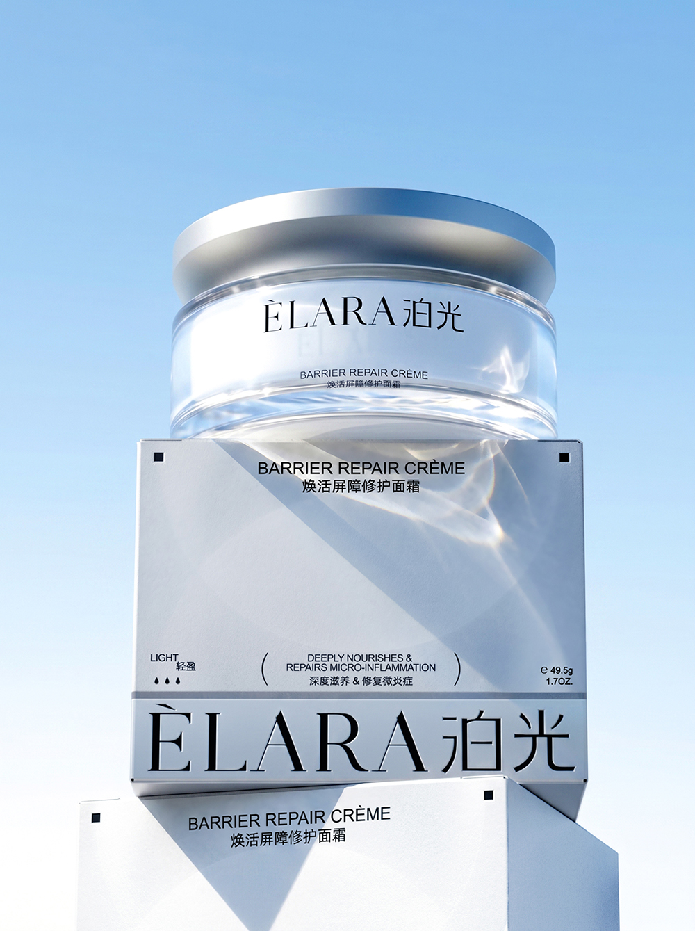
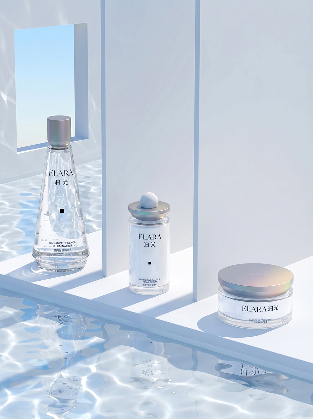
The product imagery carries this visual language further. Soft blue tones, water surfaces and refracted light create a fresh, hydrated and luminous atmosphere, presenting the products as though surrounded by a gentle glow. Consistent typography, colour and material choices connect the three products, while variations in bottle shape and format establish clear distinction across the range. Together, these elements form a cohesive visual system that balances scientific credibility with a refined, premium expression.